Snapfish vs Shutterfly – Which is Really Better?
Photo Print Pictures June 11, 2017 Editorial Staff 0

Snapfish and Shutterfly are the two largest online print labs in the US, and a popular choice for printing everything from traditional photo prints to wall canvases to personalized items like coffee mugs. Here we’ve set out to provide the most comprehensive comparison of Snapfish vs Shutterfly on the web.
In order to thoroughly test the print quality of both Snapfish and Shutterfly, I ordered an identical series of photo prints from each lab. I am an experienced photographer, and all test images were edited and reviewed on a color calibrated screen. All images were ordered without color correction to ensure a fair comparison to the original image file.
For the professionals that may be interested in such detail, I have also included the exif data for each test image. All images were shot with a Nikon D750 camera body.
Snapfish vs Shutterfly Print Quality
While I attempted to evaluate all aspects of ordering photo prints from these two companies, the single most important factor is the quality of the photo prints. So, is Snapfish or Shutterfly better in terms of the quality of their photo prints? Here are detailed side-by-side comparisons of five test prints to help us decide.
Snapfish vs Shutterfly Quality Test 1 – Portrait
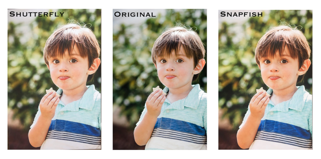
For the first print quality test, I used a snapshot of my son. Portraits (images of people) are the most common type of photo that consumers print. The main intent here was to test the accuracy of skin tones to determine whether Shutterfly or Snapfish produced the most natural looking colors.
The first thing I notice is that the Snapfish print is much warmer than the original image.The original image had very film-like colors with a bright exposure, cooler skin tones, and cool bluish green tones in the background. In the Snapfish print, the skin tones contain significantly more orange and red undertones than the original. It does not look unnatural, but it is much warmer than intended. The greens in the Snapfish print also have a distinct yellow undertone, compared to the blue undertones in the original image. Sharpness and clarity are both very good, and comparable to the original image, which can be seen in the eyes.
The Shutterfly print also contained more orange and yellow hues than the original, but not as noticeably as the Snapfish print. Again, the coloring still appeared natural so this is not necessarily a problem, but it is not an exact match to the original file. The Shutterfly print also had the same issue with yellowish greens, rather than the bluish greens in the original image. The sharpness and clarity in the Shutterfly print was very comparable to Snapfish. Both images printed slightly darker in exposure than the original.
Winner – Shutterfly, by a small margin. While both images contained more orange and yellow undertones than the original, the Shutterfly print had the most accurate skin tones when compared to the original image file.
Snapfish vs. Shutterfly Print Quality Test 2 – Landscape Image
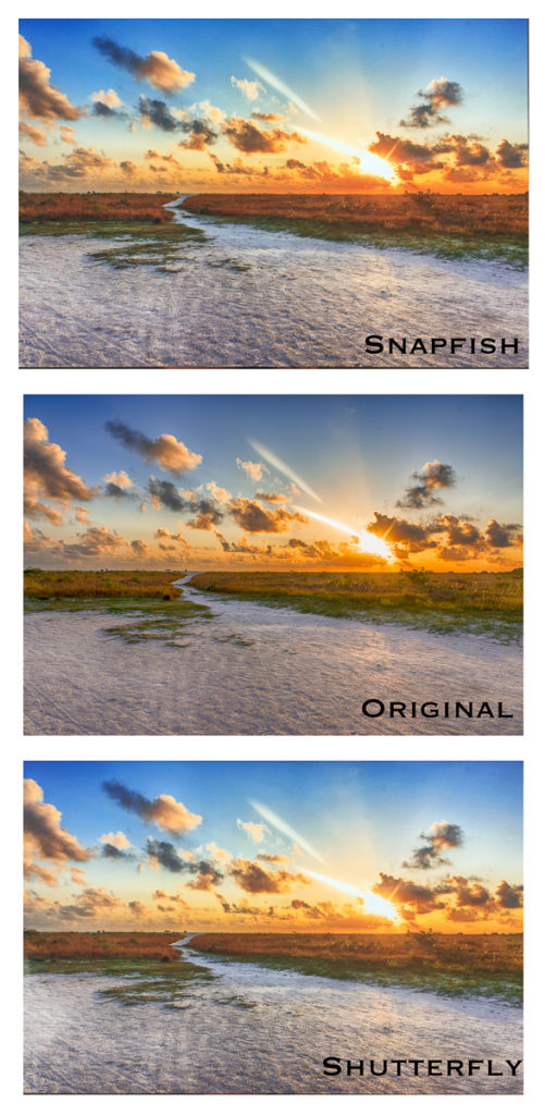
For the next test, I selected a landscape sunset image. While the first image was take in the evening with cooler color tones, this sunset image is much warmer and brighter. This is intended to test the representation of very warm color tones like red, orange, and yellow.
Again, the Snapfish print is warmer than the original. There are more yellow tones throughout the print, especially in the sandy beach areas. There is more orange in the shrubbery as well, which appears to be a bit oversaturated. The blues are a lighter hue than the original. Overall, the print is very pleasing to the eye, as it was a warm hued image to begin with.
The Shutterfly print was very similar to the Snapfish print in this test. It also had warmer color tones, with more saturated oranges and yellows than the original. The Snapfish print suffered from more red tones and the Shutterfly print seemed to have more orange tones. This difference can be seen most clearly in the vegetation.
Winner – Tie. For the landscape image, both Snapfish and Shutterfly were on pretty equal footing. Both printed slightly warmer than the original image, but neither was different enough to damage the effect of the image. For a warm toned image with no people, either print lab will produce a satisfactory result.
Snapfish vs. Shutterfly Quality Test 3 – Macro Image
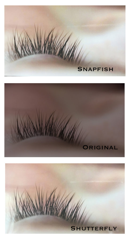
For the next test, I selected a macro image taken in low light. The intent here is to compare the sharpness of the detail in the lashes, and the accuracy of exposure and color toning on a very dark image.
The Snapfish print is much, much brighter than the original image. It appears to have been raised in exposure by at least two full stops. It’s important to note that I specifically chose not to color correct any of the prints when I placed my order. To me, these appear to have been adjusted anyway. Aside from the exposure issue, the image is printed nicely. The detail and sharpness in the eyelashes is very strong, just as sharp as the original. There is a bit of grain in the print, but you would have to look very closely to notice it.
The Shutterfly print has also been brightened much more than the original, but not quite as much as the Snapfish print. Overall, the Shutterfly print has less contrast than Snapfish. It is also slightly less sharp, which you can see when comparing the eyelashes in each image. The grain is also minimal in the Shutterfly print and would not be noticed by most people.
Winner – Snapfish actually takes this one, but by a small margin. Both images are poor representations of the original, due to the huge difference in exposure. However, the Snapfish print does a better job of highlighting the detail in this macro image due to the higher contrast and slight sharpness advantage.
Snapfish vs Shutterfly Print Quality Test 4 – High Dynamic Range Image
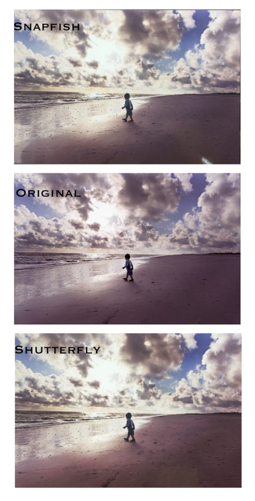
For the next comparison, I selected an outdoor image with a high dynamic range. This simply means that the images has a wide range of light and dark areas – from the very bright white areas in the sky to the dark corners in the sand. Selecting this type of image allows us to see how each print lab handles printing both the extreme dark and light areas of the picture.
The first thing we notice is that the Snapfish print is much warmer in color than the original image. There are significantly more yellow tones in the light areas. And the magenta tones from the original image have taken on a yellow cast as well. The print is also lighter than the original, with more details showing in the shadowed areas. For me, this ruins some of the effect of this dramatic nighttime landscape. The blues in the sky are much lighter than the original. Overall, I was not happy with the color variation in this Snapfish print.
The Shutterfly print is also a bit lighter and warmer in color tone than the original, but not to the same degree as the Snapfish print. This print retained more of the original magenta coloring. And the blues are more true to the color tones in the original, although still a bit too light. Overall, the Shutterfly print is closer to the original in terms of both exposure and color.
Winner – For the high dynamic range image, the winner was Shutterfly by a small amount. Both images were too warm in color tones, but Shutterfly was more closely aligned with the original image file.
Snapfish vs. Shutterfly Quality Test 5 – High ISO Image
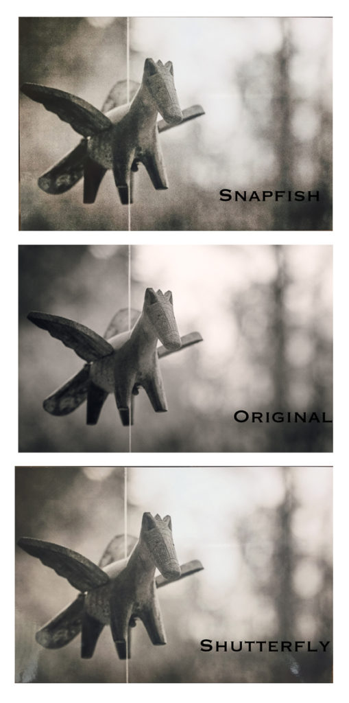
This final test was meant to be one of the more difficult comparisons. I selected an image that was shot with a very high ISO, with noticeable grain. The objective was to see how the grain was rendered in the photo print.
The Snapfish image had a ton of noticeable and very ugly grain. In fact, it had more noticeable noise than any other consumer print lab I have tested. It appears that the image has been over-sharpened, bringing the grain into sharp focus as well. This print was again much warmer and brighter than the original, with yellow undertones. The warm undertones almost made this look more like a sepia print, rather than a true black and white photo.
The Shutterfly print was also warmer than the original, which is clearly a pattern with both services. But it was again closer in color to the original than the Snapfish print. The grain is much less noticeable and smoother in the Shutterfly print. However, the Shutterfly print is less sharp overall. If you look at the details on the horse’s face and body, you can see that the Snapfish image is just a bit sharper. I strongly prefer the smoother effect in the Shutterfly print for this image.
Winner – Shutterfly, by a wide margin. This is a good illustration of the tradeoff between sharpness and noise. The Snapfish print is sharper overall – but that includes sharpening the imperfections like grain, as well as subject of the photo. In this case, I prefer the slightly softer Snapfish print, as the smoother background is much more pleasing to the eye.
Shutterfly vs Snapfish Customer Service
Both websites had relatively easy to use ordering systems. I personally found Snapfish’s interface a bit more intuitive but was able to order my five prints in just a few minutes on either site.
Processing and shipping time was identical for both Snapfish and Shutterfly. The Snapfish prints were shipped on the same day the order was placed, and the Shutterfly prints were shipped the following day. The packages arrived on the same day via USPS mail. For both orders, I received an email with tracking information.
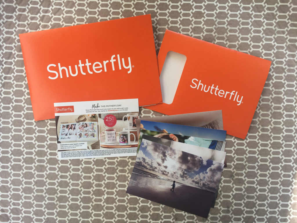
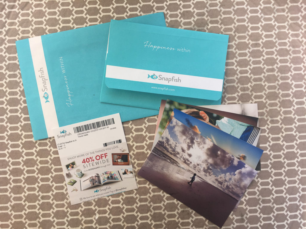
Both the Snapfish and Shutterfly prints arrived in similar packaging. They both consisted of a large mailer envelope, with a smaller envelope inside for the photo prints. Both included a small piece of cardboard backing to minimize bending during shipping. The Snapfish prints arrived with a 40% off coupon for my next purchase, while the Shutterfly prints arrived with a 25% off coupon.
Snapfish vs Shutterfly Pricing Comparison
Pricing for both Snapfish and Shutterfly was similar. For these 4×6 test prints, I paid a total of $2.92 at Shutterfly and $2.44 at Snapfish.
Snapfish
$0.45 for 5 prints
$1.99 S&H
$0 tax (Georgia)
Shutterfly
$0.60 for 5 prints
$2.11 S&H
$0.21 tax (Georgia)
Snapfish has a slight advantage over Shutterfly on pricing. However, this was not significant enough to be a factor in the decision for me.
The Final Decision – Shutterfly vs. Snapfish
So which is better – Snapfish or Shutterfly? Ultimately, these are both fine choices for everyday photo prints or gift and home décor items. Neither was able to produce an exact match to my original image file, however that is what I would expect for a consumer print lab. Professional photo print labs are much more diligent (and properly equipped) to provide proper color calibration.
However, in this comparison of Snapfish and Shutterfly, I found that the Shutterfly prints more closely reproduced the color tones in my original image. This difference was most noticeable in portraits of people, where accuracy of the skin tones is most important. No one wants orange skin tones in their photos! I did find that Snapfish had a slight advantage in terms of sharpness, however that led to issues when printing images with some grain.
Personally, I find the accuracy of colors to be the most important factor when choosing a print lab, so I would choose Shutterfly for my personal photo prints. Check out all the details on Shutterfly photo prints here.
If you prefer to print your photo prints in person, check out our article on Costco photo printing. They are well known for providing high quality prints at good prices to their members.

No comments so far.
Be first to leave comment below.